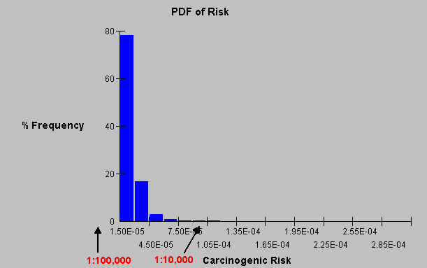
Here is the Probability Density Function of the cancer risk based on the Monte Carlo analysis. If you add the % frequency of the first two bars, which add to about 96%, the chart says that there is about a 96% chance the risk less than 4.50E-05 or 1:22,222. It's hard to scale the very small bars, but there is 99.9% chance the risk is less than 1:10,000.
If we look at the log of the risk below, which is the same raw data, we see that there is virtually 100% chance the risk is less than 10-3.9 or (just invert) 1:12,590. (Of course you would round these to one or at the most two significant figures.)
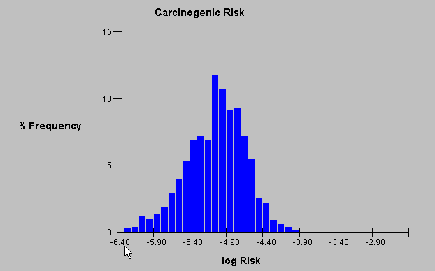
(I'm not sure why RISC prints the odd number on the x axis.)
A handier way of looking at risk is uses the cumulative probability as below:
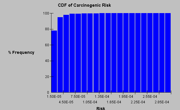
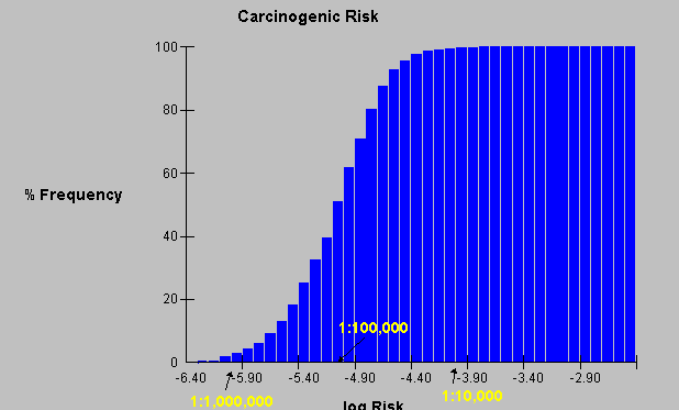
Where the risk is shown as 96% below 4.50E-05, 98% below 7.5E-05 and so on. It is clearer when the X axis is converted to a log scale:
Monte Carlo works as well for non-carcinogenic hazards that have an HI:
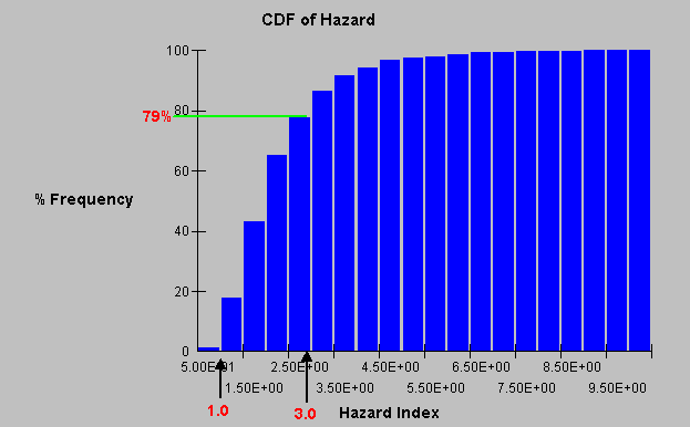
This would show there is about a 79% chance the HI is less than 3, or about a 99% chance the HI is greater than 1.
Monte Carlo analysis is a powerful tool. Forward to Food Chain.